One of the most boring conversations to endure with creatives is the debate over the size of the logo or the merits of the product shot. Put simply, most creatives seem to think that the smaller the logo, the greater the excellence of the work.Likewise, the more the product features, the more their idea is tarnished.
It's as if agencies cannot bring themselves to admit they're employed to sell things. Nothing more. nothing less.
It's true of course, all of Peter Field and Les Binet's great work on effectiveness shows a direct link with between highy creative work and ROI. Also, work that that makes people feel something and makes them talk.
This makes utter sense when you read Byron Sharp's work on the need for brand salience (get noticed, be distintive) to get on the radar of the buyers that matter for growth – the majority of light buyers.
But the most creative AND effective work is not that which makes the advertising famous alone, but ads and stuff that makes the BRAND and PRODUCT famous. Because, coming back to sharp, brands grow by building and refreshing distinctive memory structures. Creating distinct, long lasting symbolism and associations and building relevant and consistent meaning into them.
Put far less pretentiously, when people don't think about this stuff much (and they really don't) , you need to work with what they already know and think. Which means:
1. Building on and adding to the feelings and 'brand stories' already in their heads.In other words, don't change what the brand means to people, find ways to make that relevant, distinctive and likeable. In other words, try and change how they feel about what it means – because in the long term, that's all that really matters.
2. Making sure they can find you without much effort in the retailer, in Google search or whatever. In other words, don't hide the damned logo or the product, be proud and make them part of the story.
Good agency professionals are increasingly wary if bludgeoning customers into submissions with banal LINK tested 'messages' and seek to surprise, delight, seduce and even include them. Somehow, showing the product and brand has been lumped with the former.
Wrong.
Think about some of the most groundbreaking, talked about and succesful work of recent years.
Old Spice doesn't pretend it's not from the 1970's and overtly masculine, it's just makes that 'experience' and expertise in 'man skills' relevant, entertaining and culturally significant. And is built around the simple fact that the product smells 'manly' not 'girly'. And he's holding the product right up to you.
VW 'The Force'. It shows plenty of metal and is build around a product fact – you can't start the engine with a key.
The Eminem Chrysler commercial has him driving the car, shows it in the streets and is all about the fact the cars are built in Detroit – firmly breaking new ground for the brand's place as an icon of American identity.
Or, for that matter, compare the Market that continuously builds fame for the word 'market' for Google search. It still heroes the logo (though I wonder if people are beginning to talk about the advertising rather than the brand…and wonder how much this matters).
Compare that with the Gorilla. I'd wager it was massively effective short term, but failed to build long term memory structures, because people talked about the advertising, not the brand. However, note they still used purple, which is utterly owned by Cadbury in the catetegory.
That's why these John Cleesea ads bombed back in the 1990's. They arer completely apposite to the 'good food heroes' link people have in their heads about Sainsburys.
But this is less as much about design as it is about ads. Like I said, people need to be able to find you quickly on a shelf, because, as proven by Sharpe, most people can't be arsed to make the effort and will choose an alternative if they have to work too hard. That's why building up recognisable symbolism and imagery is so important.
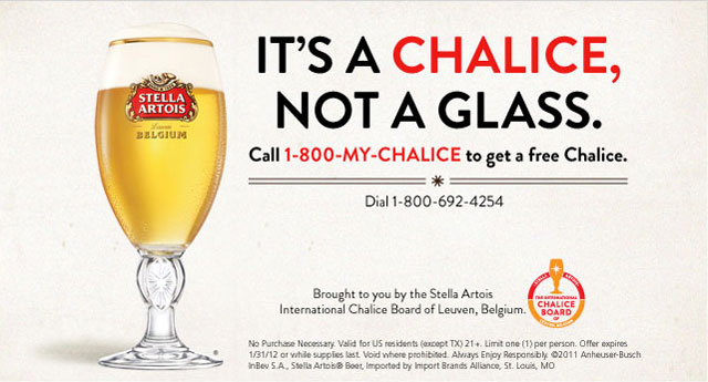
Think about Stella Artois building on. not breaking, it's Franco-Belgian story with a distinctive chalice, that's a relevant, distinctive symbol within the actual drinking occasion.
This is also why you change your packaging design at your peril.If people don't recognise it quickly, they'll buy something else
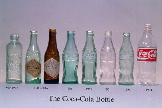
That's why, looking at the Coke bottle, you see slow evolution where decades later, you can still link the latest version with the very first (and why the bottle is used in ads rather than the more commonly bought can I imagine).

And Coke is red. It won't change this because the powerful memory cue is too valuable.
Just like Orange is, well Orange.
In conclusion, rampant creativity alone is not enough. You should always insist in making the logo bigger, heroing the product and building and refreshing a distinctive brand meaning.
People can't be arsed to think about brands, they can't be bothered to look for them and they're only too easilly persuaded to choose something else.
If you don't build distinctiveness and recognition, you're just trying to make art or entertainment. Resign now and get a job with the BBC or HBO.
And one more thing, here's some work that doesn't just have a big logo, the logo is all it is (great use of low budget too).


Leave a comment